

Colour Wheel for my Triad
In this article we look at creating a colour wheel using a bright colour triad made using three cool primary colours. Then we’ll use that triad to choose analogous colours to affect the mood of your sketches. We also pick a complimentary colour for an accent colour to create a focal point.
Working with Colour Triads
If your goal is to elevate the colour harmony within your sketches, then choosing a colour triad of three primary colour (red, yellow, and blue), simplifies your palette and really helps to increase the cohesiveness of your sketch. Based on there three primaries you choose, can really affects the feeling your sketch evokes.
Follow this link to Jane Blunell's page about colour triads. She's the go-to resource for information about colour triads, and has even written a reference book for them.
Part of the fun of working with colour triads is deciding which primary colours to incorporate into your colour wheel. Your decision about whether to include a warm or cool version of the primary into your triad, can affect the overall mood of your sketches.
One of my favourite Colour Triads
Triads can get overwhelming, so I chose this triad to start using in some of my urban sketches. I want to familiarise myself with this colour combination, but also to road test the viability of using triads in my people sketches. Is it even viable?
- DS – Hansa Yellow Light (cool yellow)
- DS – Quin Rose (cool red)
- WN – Cobalt Turquoise Light (cool blue)

I prefer to use transparent colours in my sketches, but I make an exception for this turquoise, and the one from Winsor and Newton is a delicious shade. No palette of mine is without it, so it’s only natural that it becomes the backbone to this triad. I really like it for its granulation, especially when it’s mixed with Quin Rose to make a granulating violet.
Simple Street Scene using this Colour Triad
I sketched a simple street scene today to practice with this colour triad, and the only challenge I had was trying to create a green dark enough to add shadow-interest to the bushes. When you mic CTL and HYL you get a pretty vivid green, but I added a little bit of QR to it to desaturate the colours and was able to create the colours I was aiming for.

Creating a colour wheel isn’t an exact science, and the secondary colours in my wheel were a bit off, so I had another go at creating the secondary colours separately. But this reference sheet works well for planning which analogous colours to choose for a sketch.
What are Analogous Colours?
As an artist, one of the first things you learn about when you’re first introduced to a colour wheel, is complimentary colours, and they can impact colour harmony in your sketches. But I’ve never bothered learning about analogous colours or how to use them, | just never saw the need…until now.
Analogous colours are ones next to each other on the colour wheel, and when they’re paired with a complimentary colour, it creates a dynamic combination with a strong feeling of colour harmony.

The analogous colour gives you that strong foundation of harmony because no matter which colour segments you choose from in the colour wheel they’ll have a common thread running through them. If you take a standard 12-colour wheel, with 3 primary colours, 3 secondary colours, and 3 tertiary colours, here’s some examples or choosing three analogous colours:
Use a primary colour, and the tertiary colour either side of it:
- Yellow-Green, Yellow, Yellow-Orange
Use a secondary colour, and the tertiary colour either side of it:
- Yellow-Orange, Orange, Red-Orange
Use a primary colour, a secondary colour, and a tertiary colour:
- Yellow, Yellow-Green, Green
These examples show three colours in each analogous set, but there’s no hard and fast rule about how many colours you can pick from your wheel. But a general rule of thumb is that 3-5 colours works best because it creates strong feeling of harmony. And then when you add a complimentary colour into the sketch, that create a focal point because of the level of contrast it creates against the analogous colours.
Examples of using Analogous Colours
Here’s some quick examples (on copy paper) to illustrate how you can adjust the vibrancy and warmth of an image based on the colours you pick for your analogous set. You’ll also see I used a complimentary colour on the glass and watch strap to create a focal point.
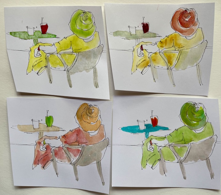
I know when I started looking at using colour triads, my first thought was “well I can’t paint successfully with a triad, I need more than three colours”. But even if you choose an analogous set picked from a small section of your colour wheel, you’ll be able to create a plethora of variations within that.
Experiment with Mixing Two Primary Colours Together
The best way to discover your colour options, is to just experiment with varying the quantities of a mix so that you can see the breath of variation you can create. For example:
- Take a primary colour (e.g. yellow), and gradually add a little bit of another primary colour (e.g. blue) and see what variations of green you can create.
- Then repeat this experiment to create greens, but switch which primary colour you start with.
- Then do this same experiment for each of your primary colour pairs (red + yellow x2, yellow + blue x2, blue + red x2).
Often in a pair of watercolours, one colour is more dominant than the other. When you do the same experiment, twice, but in a different order, you’ll get different variation in your results. This will help you learn which colour it’s best to begin with when you’re mixing two together.
Creating Desaturated Browns and Greys
Also, when you sketch with an analogous set, you have the flexibility of mixing all three colours from your triad together to create a broad selection of greys and browns. These can be used to add neutral areas to your sketch, which don’t complete for attention against your analogous set of colour, but that will compliment them and boost the feeling of colour harmony.
Here’s the first urban sketch I did using the analogous colour palette:


