

Harbour Sketch of the Greek Island of Halki
This post includes exploratory sketches to practice Greek Island scenes with ink and watercolour. Each one provided some valuable insight for my upcoming trip, and I’ve summarised a list of key takeaways at the end of the page.
Greek Island Watercolour Postcards
I’m planning a trip to the Greek Islands of Crete, Karpathos, Halki, and Rhodes, and really want to fill my sketchbook with a bunch of loose and simple Greek Island sketches. I usually sketch people, and the occasional building, so sketching island-scapes and seascapes is unfamiliar territory. So I’ve been searching out some inspiring photos to sketch from to get my eye-in, and having a go at doing simple line drawings and adding watercolour. I don’t want to spend a lot of time on one picture – I’d rather they be fast and loose, and full of life.
Finiki Beach, Karpathos
We’re going to be spending a week or so at Finiki Beach, so that seemed like an obvious place to start. It’s a small residential area with some of the best restaurants on the island (apparently), and we’re staying in the cutest looking apartment in the thick of the village.
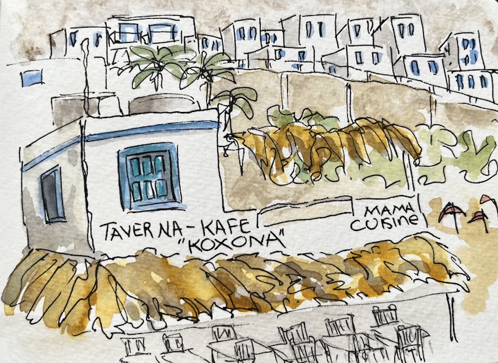
I like the idea of sketching a lot of small white buildings and just adding some tonal shading, and a little bit of colour for the windows and doors. I’m hoping they’ll be a few houses festooned with bougainvillea so I can add big splashes of pink, orange, or red.
A different view of Finiki Beach, with the church on the hill. I like the tonal shading and the beach umbrellas. The cafe umbrellas were white, but I used a pale orange to complement the turquoise. I like the use of white space with a bit of tonal shading. I have a feeling i’ll be doing this view a lot once I’m there.

I think on these type of sketches where there’s lots of white walls, using quite dramatic tonal shading would work best. Also, not using too many colours – possibly limiting the selection to two colours, and experimenting with adding Buff Titanium or Neutral Tint to the mixes to create a broader range of colours.
A final go at this Finiki Beach scene, this time not adding any ink lines in the hillside behind the houses to see how this affects the feeling of depth by only using watercolour. I think it works a lot better than the sketch above, because in that one – the lines are distracting and don’t add any value.

Kasos Island Near, Karpathos
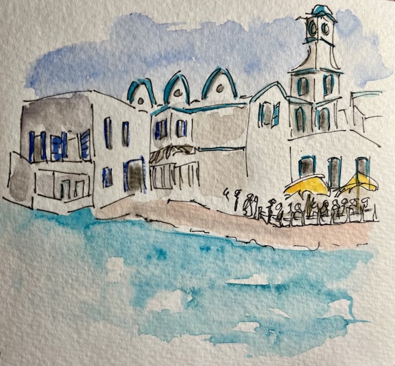
Halki Town Harbour, Halki
The clock tower is an obvious focal point, as it’s the tallest building in this harbour town. I’m wondering how many times I’ll sketch it during my stay. For my first attempt from a photo I tried using really loose lines. It’s a bit too loose for my liking, and the colouring is all wrong, with no clear focal point. But this is the reason why I’m doing some pre-trip sketching, so that I can iron out the wrinkles and sketch better pictures on location.
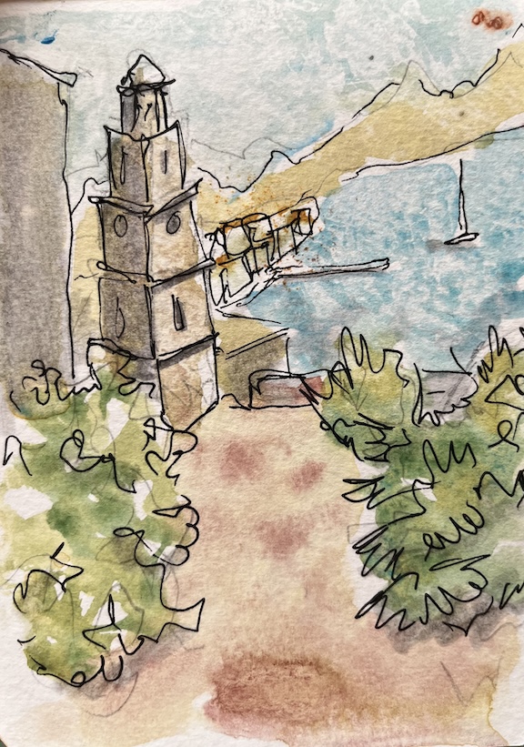
A simple fix for this scene is to make the clocktower in the mid ground, the focal point and use a heavier line and more saturated watercolours. The foreground could be sketched with a thinner line with a bit more detail, but less saturated watercolour, and the background could be rendered with a thinner line, or just use watercolour and no ink line.
This version of the clock tower and harbour in the background has a more pleasing composition, an my favourite part of the sketch is the foreground foliage. I used minimal loose ink lines to map out the shape, and then added multiple layers of watercolour. The tower looks a little like the Leaning Tower of Halki though!

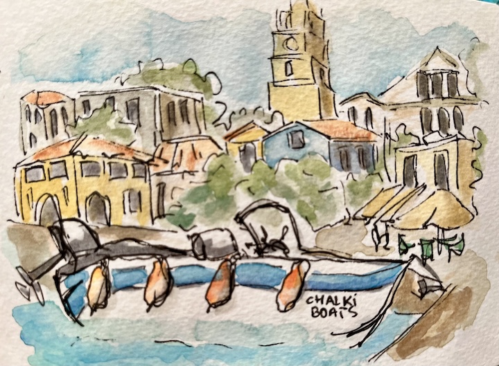
This next attempt at the Halki harbour scene is much more successful. I like the boat in the foreground as a focal point. Even though the clocktower is in the background, it’s not a focal point because I sketched it with lighter lines.
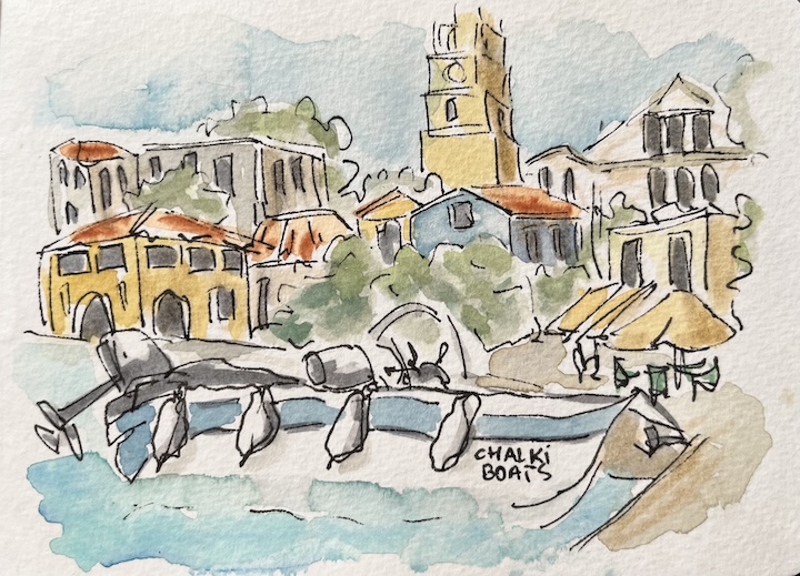
There’s still not enough depth to this scene, but this could have been fixed by sketching the buildings in the mid ground with a thinner pen, and maybe not using as many colour, or making them more desaturated. The background buildings would have worked well as tonal shadows only, with no (or minimal) ink lines.
I had a go at trying to fix the depth issues, by adding darker lines to the boat and used a more saturated swath of blue on the hull. I also lifted off some of the watercolour on the background buildings – especially the roof area where that transparent red oxide is too vivid for areas that aren’t the intended focal point. These tweaks give the sketch a greater feeling of depth, but there’s plenty of room for improvement.
Sketching Greek Islands Quickly
I like sketching directly in ink, and really like using ink lines when I sketch people, but for these travel sketch postcards, I think I need to adopt a looser watercolour style with less ink lines. I’m looking forward to experimenting with both approaches and see which one resonates with me the most. I’ve always thought I would adopt one sketching style – ink first then watercolour, but I’m realising that my style can deviate based on the subject matter and mood I want to evoke with a sketch.
I’m treating my upcoming trip like an art retreat and plan to do at least one postcard size sketch a day to experiment with styles. I’m taking an A6 sized sketchbook and maybe some loose postcard-sized pieces of watercolour paper to practice on.
My Key Takeaway from these Sketches
- Identify the foreground, mid ground, and background BEFORE I start sketching, so that I can vary what I use to establish the different composition layers.
- Squint while capturing complex shapes (like bougainvillea) to simplify how I depict lights and darks and shadow areas.
- Multiple layers of watercolour help to define tonal values and are more effective than lines for defining edges, depth, and overall shape.
- Bear in mind that ink lines attract attention. It’s best to add these at the end so that you know where you really need the emphasis of ink. Consider using water soluble ink so that you can soften it with water, which will remove the starkness of the lines.


