

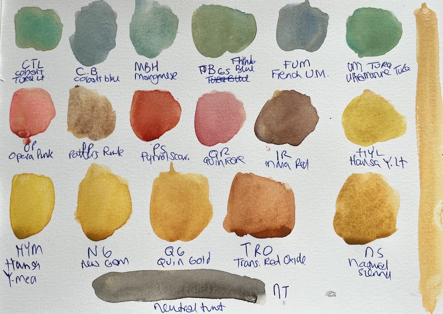
Swatch of Naples Yellow mixed with the other colours in my palette
Adding Naples Yellow to my Watercolour Palette
Although I decided I wasn’t going to change the colours in my palette all year, I realised that it made sense to make a couple of little tweaks based on a change in summer location, so I added Naples Yellow to my palette. The Daniel Smith version is made up of three pigments PW4 (Zinc White), PY97 (Arylide Yellow), and PR101 (Venetian Red), and is not granulating.
Naples Yellow is semi-opaque and mutes the vibrancy of other colours it’s mixed with. I swatched my newly acquired Naples Yellow (DS) with all of the other colours in my palette and it has turned them into a palette of creamy pastel versions of themselves, much like when I swatched all my colours with Buff Titanium. But the Naples Yellow versions have more light and life to them.
Using Naples Yellow to Mix Greens
All of my blues have been turned into powdery greens with a desaturated presence that aren’t in any danger of overwhelming a scene. I like the idea of having a full selection of greens that can blend into the background, and Naples Yellow seems to mix beautifully with all of my blues.
- When mixed with Phthalo Blue green shade the Naples Yellow would be ideal for the shallow area on the shoreline where the sand is reflected through the blue water to create an aquamarine colour, that seems to reflect the light.
- When mixed with French Ultramarine, the Naples Yellow creates a granulated and muted sage green with would be perfect for distant hillsides on the landscape.
- When mixed with Cobalt Turquoise Light, the Naples Yellow creates some beautiful granulation, that would work really well when painting seascapes.
These are the greens I feel like I’d use the most, but I do like the slate-ish blue green created when Naples Yellow is mixed with Cobalt Blue, and this would make a beautifully subdued colour for window shutters or doors.
Using Naples Yellow with Reds/Pinks
All of my bright reds and pinks have been turned into earthy tones, the favourite of which are Opera Pink and Naples Yellow, and Quin Rose and Naples Yellow.
When mixed with Opera Pink, Naples Yellow creates a vibrant coral pink, which will be great for adding that late sunset glow just before the sun dips below the horizon, or as the highlight colour when painting bougainvillea.
When mixed with Quin Rose, Naples yellow creates a blush pink that would be good for terracotta roofs, either for the highlight accent, or the sun-bleached areas. It is also soft enough to be use for skin tones, especially for sun worshipper’s who are turning a lovely shade of salmon pink!
Using Naples Yellow with Neutral Tint
When mixed with Neutral Tint, Naples Yellow creates a beautifully subdued earth tone brown, that would work well for distant landscapes that would recede naturally, or to create warm shadow tones on cliffs or buildings.
Video About Daniel Smith’s Naples Yellow
If you want to find out the history to Naples Yellow, here’s a video where Rocketsack Creations explores the Daniel Smith version of Naples Yellow watercolour, and how to use it to quietly suggest warmth, atmosphere, and place.


