

Experimenting with Watercolour and Mixing Colours
Live Run Through of Liz’s Watercolour Course
Liz Steel is doing another run through of her watercolour course, and I’ve been working my way through the exercises each week. I’ve spent the past few months finalising my watercolour palette, and plan on spending my seven weeks of this course to get to know my colour selection better and build my colour mixing skills for my urban sketching adventures.
Watercolour Mixing Cababilities
This week the tutorials and assignments were about mixing and layering. We had to choose at least four combinations of two colours from our palette that we use a lot in our everyday sketching, and to explore the colour mixing capabilities of each combinations.
Colour Mix: French Ultra Marine (DS) and Burnt Sienna Light (DS)
French Ultra Marine and Burnt Sienna are a winning combination for creating both warm and cool greys. In my palette I have Burnt Sienna Light and this works equally well. The FUM is more dominant, and both are transparent granulating colours.

This combination is my automatic go-to for mixed greys and these two colours are right next to each other in my palette, I have Neutral Tint in my palette, but don’t use that for grey, just for mixing.
Colour Mix: French Ultra Marine (DS) and Hansa Yellow Medium (DS)
Last year I had Sap Green and Undersea Green in my palette, but I took them both out and replaced them with Phthalo Green, but then at the beginning of the year I took it out and added Sap Green back in, which is my go-to quick grab green for foliage. But I still prefer to mix my own greens when I’m not urban sketching in a rush.
I don’t sketch a lot of foliage, but when I do, this combination is really versatile for creating a variety of dark to light mixes for foliage with a strong feeling of colour harmony.
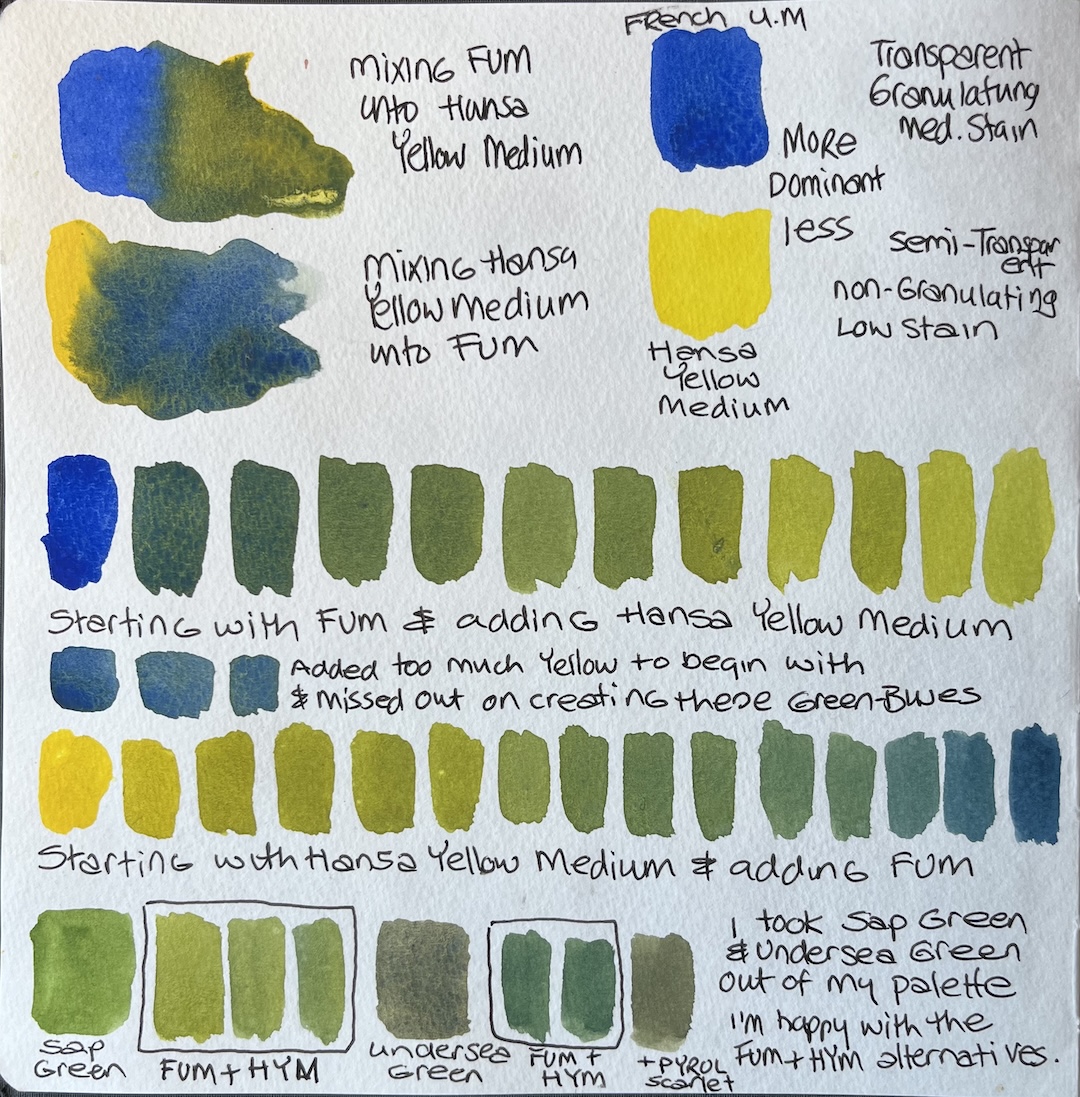
I use a lot of lime green in my sketches, mainly for clothes, and sometimes I create the lime green with Cobalt Turquoise Light, Phthalo Blue, or Manganese Blue, mixed with Hansa Yellow Medium.
Colour Mix: Manganese Blue Hue (DS) and Indian Red (WN)
Even though Indian Red is an opaque colour, and I prefer to use transparent or semi-transparent colours in my palette, you don’t need much Indian Red in the mix to impact the less dominant transparent Manganese Blue Hue.
I use this mix for the roof tiles here in the Algarve, and the granulation creates some nice textures. I use Winsor and Newton Indian Red, because the Daniel Smith alternatives were too transparent or orangey. So I decided to stick with the W&N version.

This combination also creates some warm and cool grey mixes, and I especially love the look of the soft greys that Manganese Blue Hue and Indian Red create. It can also create a soft warm brown, but I’m more a fan of a cool brown like Raw Umber.
Colour Mix: Hansa Yellow Medium (DS) and Opera Pink (DS)
This combination is probably the duo that I mix the most. It’s just AMAZING! The variety of oranges, peaches, yellows, and pinks it creates is absolutely delicious. I used to have Transparent Pyrrol Orange in my palette, because orange is my favourite colour (in art and life!), but I much prefer to mix my own versions now. So I took it out of my palette and use my pinks, reds, and yellow to create a dizzying array of oranges.

I use a water version of Hansa Yellow Medium (or Light) and Opera Pink for the base of skin tones, and add Cobalt Turquoise Light to desaturate it for darker areas or shadows areas on the face.
Bonus Exercise
I did an additional bonus exercise to see how I could create blooms and hard edges with this colour combinations. And I used this duo in a layering and wet in wet exercise in the course.

If you’re a fan of Winsor & Newton professional watercolours, their version is called Opera Rose. I’ve used both of these, and switch between them based on availability. There may be a difference between them, but I can’t tell the difference.
Watercolour Mixing Variances
We also created juicy washes of each colour duo, and convert it to a watery version. Then create both juicy and watery versions of each colour. And experimented with pre-wetting an area and dropping in a bit of both colours to see how they merge.

Transparency, Opacity and Granulation of my Watercolours
This was another exercise in this week’s tutorial. It was a good way to see the transparent colours in your palette and where they’re located, the non-transparent (semi-transparent, semi-opaque, and opaque), plus the colours that are granulating. The layout on the left also shows the staining level of each colour.
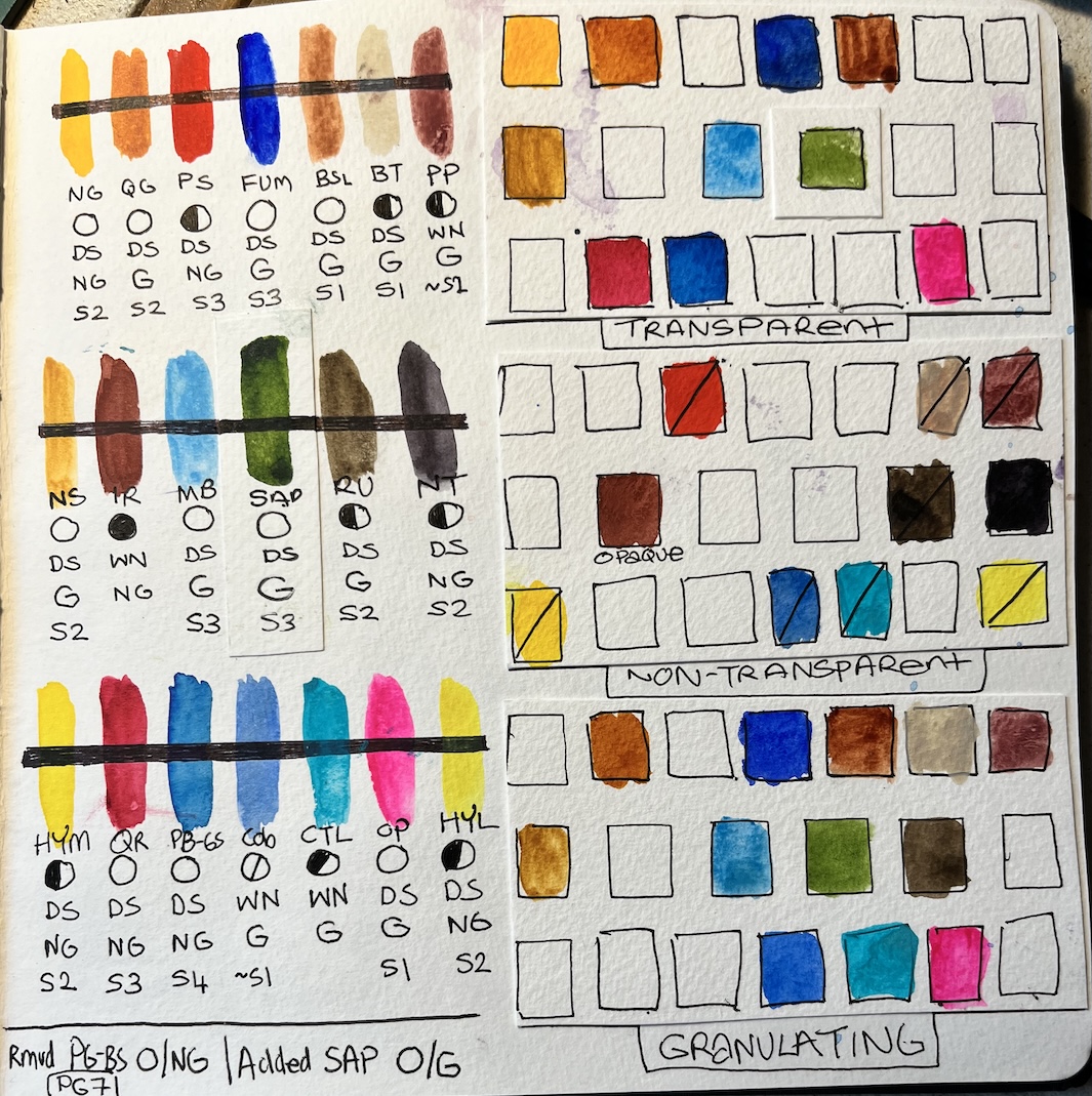
Pigment Numbers of my Watercolours and Mixing Notes
I’ve known about pigment numbers for years, but never thought I’d be bothered about them, but know that I’ve been formally introduced to them, I’m completely geeking out about the information.

When mixing colours together with different transparency and opacity, it’s a good idea to lay down the opaque colours first, because the colour granules are heavier and sink to the bottom. Then you can add the transparent or semi-transparent colours on top, and they’ll still maintain a presence.
The same order priority can be applied to staining vs. non staining colours. Lay the staining colours down first, and add the non staining on top. The staining colour won’t move around as much as the non staining. As a fan of back runs, I was interested to learn that staining colours can cause more back runs.
There were more exercises in this week two of the course besides these swatching exercises, where we painted objects and landscapes. But it’s the colour mixing that interests me the most, and I wanted to share here on my blog.


